Recreating the Roanoke Star, one neon tube at a time
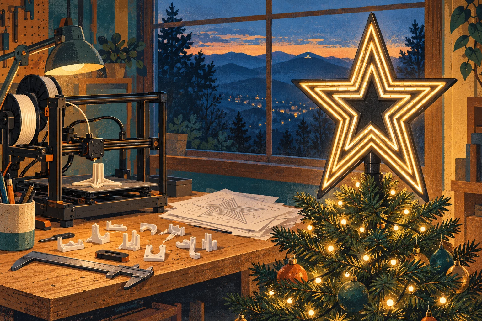
I’ve always thought it would be neat to have a Roanoke Star on top of our Christmas tree. I grew up in Roanoke, Virginia, where the star sits on Mill Mountain overlooking the city. It’s one of those landmarks that’s so familiar you can recognize it immediately without having thought very much about its shape. My family has a bit of a tradition of making our own tree toppers, and a miniature version seemed like a nice way to continue it.
I’d seen other printed versions, but I wanted something closer to the real thing: the proportions, the space between the three stars, and the individual sections of neon. I figured this would be a good project for my Bambu Lab A1, with Codex helping me research the landmark, write the modeling scripts, and work in Blender. I would inspect the results, print things, and provide feedback.
That last part became a fairly substantial job. Looking back through the project, the first experiments were in March. By October, I’d worked through disconnected supports, several versions of the star’s geometry, a file that forgot it had two colors, a 42-hour print estimate, little clips that wouldn’t clip, and a back cover temporarily held on with tape. There are two finished models, but there were considerably more than two attempts.
Both are available now: the original one-piece, two-color topper and the light-diffusing topper with a removable back. The GitHub repository has the models, scripts, research, and an unusually thorough collection of evidence about a Christmas decoration. This is how it got that way.
Learning more about a very familiar landmark
While researching this, I learned something about the original star that I’d never paid much attention to growing up: it began as a Christmas decoration. The Roanoke Merchants Association sponsored it for the 1949 holiday season, and it was first illuminated on November 23. According to the City of Roanoke, the star is 88.5 feet tall, weighs 10,000 pounds, and carries about 2,000 feet of neon tubing.
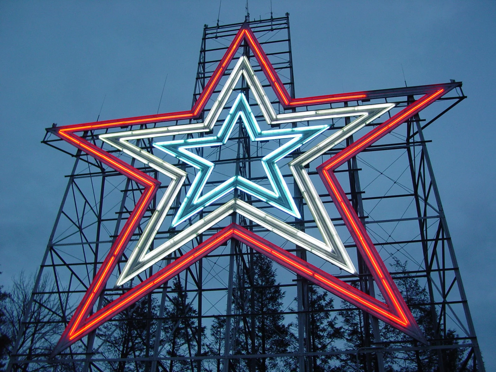

My favorite construction detail was that the star’s face was first laid out at Roanoke’s airport. Nelson Harris’s history of Woodrum Field, on pages 61–62, describes Kinsey Sign Company assembling the pieces on an airport ramp in November 1949, before installing the sign on the mountain. It was a practical way to work on an enormous shape, and it made me wonder what happened to the drawings used to lay it out.
Getting something that looked like the star
My first round of modeling, back in March, started with three white star outlines and a dark supporting structure. I wanted the supports to disappear against the tree, so the star itself would be the focus. We looked at cones, clips, springs, and rear supports before settling on a concealed socket as the initial approach. A socket seemed straightforward to print, and it could sit behind the face rather than beneath it.
The early models had more basic problems than how they would fit a tree. Some supports looked disconnected. The scaffolding was too prominent. When we reduced it, parts became disconnected again, and the separation between the three stars got worse. At one point the inner star wasn’t attached to anything that would hold it in place.
My feedback became increasingly specific. I wanted white for the star and black or dark green for the structure. I wanted less scaffolding, but enough support to keep everything together. I wanted the gaps to match the landmark, rather than whatever happened to look reasonably star-like in a render. Those requests sound compatible when written down, but each revision seemed capable of improving one and damaging another.
I also asked for small details suggesting the individual lights. The first attempts used a kind of raised bulb texture across the white rings. It made the surface more detailed, but it didn’t really resemble long pieces of neon tubing. There was a difference between adding texture and reproducing the thing that gave the landmark its appearance.
At this stage I even asked Codex to create an imaginary customer named Robert: a very particular Roanoke native who would review each revision and decide whether he’d buy it. Robert was an AI reviewer, not a real customer. He supplied detailed critiques and eventually approved a design. I then noticed that the star’s points were blunt, and later that its angles were wrong. It was a useful exercise in getting another critique, but I had given Robert rather more confidence than he had earned.
The blunt points had a concrete cause. The script was building thick lines with flat ends and combining them into rings. Where those lines met at an outer tip, the construction left a clipped end instead of a sharp intersection. The top point had a flat almost five millimeters wide at print scale. Rebuilding the rings with proper mitered corners fixed that particular problem.
The shape still needed work. The horizontal shoulders were wrong, the spacing kept drifting, and reducing the scaffold didn’t reliably produce a connected structure. Eventually I asked to remove the visible scaffolding entirely and use a recessed black backplate. That gave the white elements a continuous support and made the front much easier to read.
The following day, I found another problem: the cone wasn’t attached to the star. The model had been described as watertight, and the reviewers had signed off, but the socket was a separate piece floating behind the backplate. We extended the rear structure into the socket and checked that the dark body was actually one connected component.
That was an early lesson in how to use the checks. A closed mesh can still be the wrong object. Several individually watertight pieces can still be disconnected from one another. A list of successful tests meant more once I started asking exactly what each test established.
Looking for the original drawings
By September, finding the original drawings had become part of the project. We searched city material, the Virginia Department of Historic Resources, the Smithsonian’s outdoor sculpture inventory, and archival references from the Virginia Room. There were construction accounts, dimensions, photographs, and leads to historical documents. There was even a set of 1941 drawings for an observation tower in Roanoke, which sounded promising until we established that it was a different structure.
What we didn’t find was the drawing I actually wanted: a dimensioned front elevation showing the outer points, inner corners, and spacing of the nested stars. The research notes preserve those leads because I’d still be interested if somebody knows where such a drawing is. For this build, though, we had to work from photographs and the dimensions we could find.
Even the overall width wasn’t settled. The Smithsonian inventory gives an approximate height of 88.5 feet and width of 84.5 feet. The city’s public-art catalog records 1062 by 1200 inches, equivalent to 88.5 by 100 feet, without making the second axis clear. I couldn’t responsibly pick the number I liked and treat it as an exact measurement.
There was also a tempting shortcut: use a mathematically regular five-pointed star. That would give us precise angles and tidy coordinates. But it would establish the geometry of a regular star, not necessarily the geometry of this particular sign. At 200 mm high, the Smithsonian proportion produces a model about 191 mm wide; a regular pentagram produces one about 210 mm wide. That’s a noticeable difference on a print this size.
We kept the approximate 84.5-to-88.5 proportion as an explicit modeling assumption. The unresolved measurements and the reason for that choice are in the accuracy audit. I wanted the reconstruction to be defensible, even if I couldn’t make it exact.
Three frames, six visible paths
The photographs also changed what we were trying to model. Structurally, the landmark has three nested star-shaped frames carrying multiple sets of neon tubing. In the nearly frontal city aerial showing it lit entirely in white, six prominent light paths are visible, arranged in three close pairs.
That grouping matters. Two nearby lines are followed by a larger gap, then another pair, another larger gap, and the final pair. Six evenly spaced outlines look different, and three broad white rings miss some of the character. The colored lighting configurations are useful references too, but they can make the tube pattern harder to distinguish because different sets are lit and the colors blend in the photograph.
The all-white aerial became the main measurement reference. Ground-level photographs were better for understanding the tubing and its mounting, while other aerial views helped check the proportions. I had to keep pointing out that a photograph taken from below wasn’t a flat drawing. Copying its apparent angles directly would reproduce the camera’s view as much as the star.
We traced the six luminous paths and fitted straight lines to their edges. A star outline has ten straight segments; their intersections give the outer points and the recessed corners. The process accepted 596 samples across the six paths, with very small residuals in the source image. Symmetry, level shoulders, and the assumed width-to-height ratio helped turn that into a candidate front face.
A comparison against a separate drone photograph improved the alignment error from about 29 pixels to 16. That initially sounded reassuring. Then we tested how much the perspective correction could conceal, and found that substantially different apex angles could fit the reference under different transformations.
This was another place where the language around the result had to become more careful. We’d improved a fit to an image. We hadn’t recovered the original engineering drawing. The repository includes that uncertainty because a precise-looking diagram can easily imply more confidence than the source material supports.
From separate inserts to one print
The mounting arrangements changed several times while the face developed. A September Blender study used a tapered spring and a rear Y-brace to make the support less visible. Another candidate used a dark backing, six separate continuous white rails, and a removable socket attached with locating keys and four small screws. The rails would sit in channels and be glued in place.

That version was much closer visually, but it had its own mesh problem. A check found 163 possible self-intersections in the light rails, despite other mesh checks passing. The three-dimensional bevel on the thin rails was causing trouble around the corners. Removing that bevel while retaining the rounded outline brought the intersection screening back to zero.
It was also becoming more assembly than I wanted. There would be narrow white pieces to handle, glue to apply, and a socket to screw onto the back. Around the same time, I found another printed Roanoke Star whose individual tube treatment was closer to what I had in mind. I wanted to bring that appearance into this design, while keeping the geometry tied to the actual landmark.
I eventually made the manufacturing requirement explicit: one print, no assembly, two colors through the AMS lite. That changed the approach. The tubes became white inlays in a dark face, all printed together. The body and tree socket became one connected dark piece. There would be no pile of miniature neon sections to install afterward.
For the tube layout, Ben Schumin’s detailed night photographs were particularly useful. They show breaks in the long runs, bends at corners, and the rounded ends of individual sections. In one horizontal close-up, interruptions appeared at roughly 26%, 50%, and 74% of the run. Those details gave us something more specific to work from than a row of decorative dots.
The resulting model has 130 individual tube sections across the six paths. That’s a count of the miniature’s geometry, not a claim about the number of glass tubes on Mill Mountain. The photographs don’t establish every joint, and some details had to be simplified or repeated. The aim was to preserve the visual rhythm at a size the printer could resolve.
The tubes are 1.8 mm wide, with rounded ends and deliberate breaks between sections. They’re flush with the printing face rather than raised above it, so the detail doesn’t depend on a collection of fragile protrusions. Printing face down also puts the color work close to the build plate, where the A1 can finish it before continuing upward through the mostly dark body.
Fixing the lines, and creating a problem for later
Once the segmented tubes were in place, I noticed something wrong near the two lower interior corners. The paired paths spread apart as they approached the notch. It was subtle in the whole star, but very obvious when I looked directly at those corners.
The independently traced outlines had slightly different edge directions. The worst mismatch was about 2.65 degrees, enough to make neighboring runs look as though they were drifting away from one another. We rebuilt the paths from a shared reference, moving its edges inward by consistent perpendicular distances and intersecting them to find the new corners.
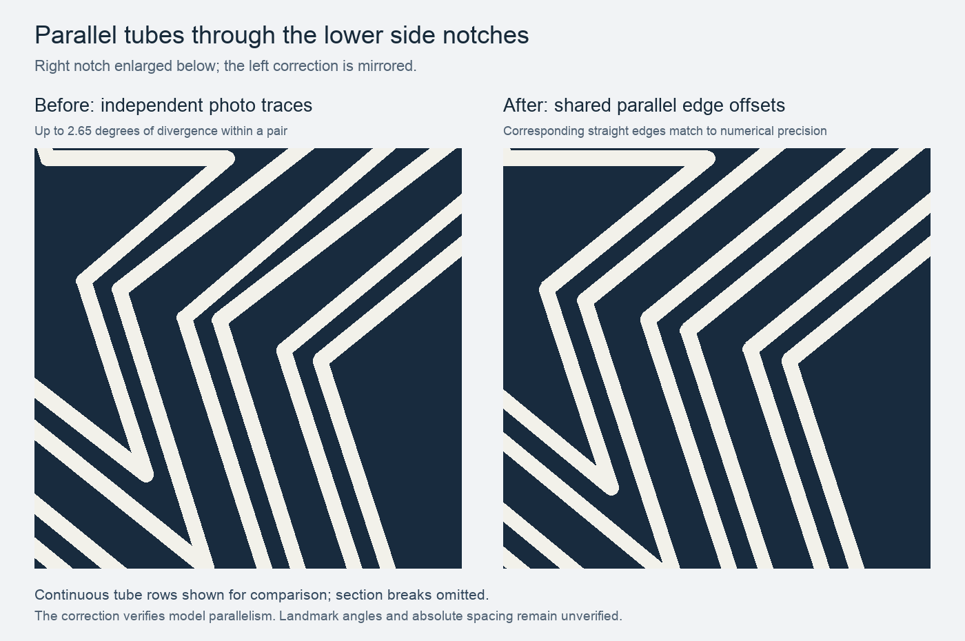
This made the corresponding edges parallel and improved the spacing through those difficult corners. Some vertices moved by just over four millimeters, which is a substantial adjustment in a 200 mm model. The correction report records the old and new geometry.
What I didn’t appreciate fully at the time was that this correction also changed the upper points of the inner stars. Deriving every outline from offsets of the outer one made the construction more consistent, but shortened those points relative to the earlier photo reconstruction. That would come back when I printed the broad, continuous white face of the illuminated version.
For the original tube-focused design, I also checked whether the larger gaps between pairs should increase. The existing gaps between tube edges were about 4.2 mm, compared with roughly 1.9 mm within each pair. The aerial supported that general relationship. We kept the tube spacing, while documenting the distinction between distances measured from tube centers and the actual empty space between their edges.
The file was two colors; the slicer disagreed
Getting the model into Bambu Studio introduced a different kind of problem. The 3MF contained dark and white materials, but Bambu’s slice showed only one filament. I printed from the separate STL material files instead, and the result looked pretty good. That established that the physical design was promising, while the supposedly convenient project file still needed fixing.
The issue was that display colors weren’t enough. The generated file needed Bambu’s explicit assignments from each part to its filament. A model could look appropriately colored and still produce a toolpath using filament 1 for everything. We inspected a project saved by Bambu Studio itself and updated the exporter to preserve the assignments in the form it expected.
Then another problem appeared: Bambu was replacing several intended process settings with its defaults. We had values for four walls, gyroid infill, and the Arachne wall generator, but the package also needed an explicit list identifying which settings differed from the system preset. Without that list, the values didn’t reliably survive reopening the project.
This took more than checking that the file opened. We reopened the generated package, sliced it in the desktop app, exported the resulting print instructions, and checked what was actually there. An attempted command-line slice had crashed, so it couldn’t stand in for that native check.
Because the decorated face prints downward, the useful color detail is in the first five layers. Looking only at the top of the preview can make the star appear almost entirely dark. The layer inspection checked the white sections, the thin dark outlines, and the gaps at the lower corners, as well as the socket farther up the print.
Meanwhile, the physical print prompted another appearance change. Daylight photographs showed pale backing bands behind the real tubes, and I wanted that in the miniature. We added three continuous white bands while keeping each white tube separated from them by a 0.6 mm dark outline. The tube positions stayed the same, but the front looked considerably fuller.
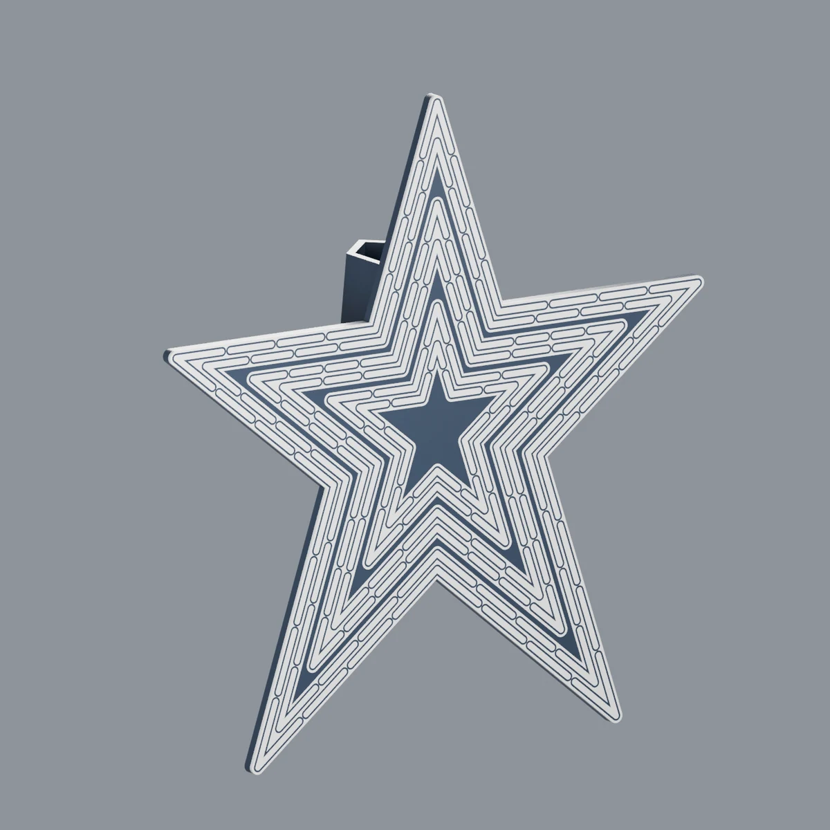
I also added a recessed christopherbrown.io mark to the back and a CC BY-NC-SA 4.0 license. The finished original is 200 mm tall and just under 191 mm wide, with an 80 mm-long tapered socket behind it. Its roof uses angled facets to make it practical to print in that orientation, and transverse holes provide somewhere to secure ties.
The checked A1 estimate came to 2 hours 47 minutes and 70.5 grams of filament, including purge and the prime tower. By September 20, I’d printed the updated model and published the first version on MakerWorld. After the false starts, it was satisfying to have a model that looked good, printed as one object, and came with a project file that actually remembered how to print it.
Making room for lights
My wife wasn’t particularly enthusiastic about putting a large, mostly black object on top of our Christmas tree. She wanted it to light up, which was a fair request for a miniature of an enormous illuminated sign. I started a separate version so the original would remain available.
My initial description was a sort of star pyramid, but what I meant was a pentagrammic prism: the same star-shaped front extended straight back into a hollow body. The tree tip and some of its lights would enter through an opening underneath. The tube shapes would become holes, letting the lights shine through.
We kept the 200 mm face and gave the shell a depth of about 60 mm. I asked for a bottom opening about 10 cm wide, leaving room to gather branches and lights into it. That opening is across the lower part of the star, not a 100 mm circular tube extending unobstructed through the whole object; the star narrows farther inside.
I originally wanted this version to be one piece too. That meant working out how to print a hollow star with a closed back without creating a large unsupported roof inside it. Tilting the model about 45 degrees offered a way to handle the geometry, and the model could be sliced. The estimate made the problem with that approach very clear.
The two-color print was going to take 42 hours 32 minutes and about 661 grams of filament. The star itself wasn’t using all that plastic. The slice involved 910 filament changes, with roughly 460 grams of purge and another 67 grams in the tower. The angled orientation had spread the two colors through the print’s height.
I wasn’t going to print that version on the strength of a successful slice. My response was to ask whether the back could snap on separately, allowing the front to lie face down. We saved the one-piece experiment, including its discouraging estimates, and tried the removable cover.

That change did much more than shaving a wall thickness or reducing infill would have done. The front could finish its color changes near the bed, then build the shell upward. The back could print flat in white alone. It also provided access to the interior and a pale surface behind the lights.
| Slicer estimate | One-piece hollow experiment | Early separate front and back |
|---|---|---|
| Total print time | 42 h 32 min | About 4 h 36 min |
| Total filament | About 661 g | About 122 g |
| Construction | Angled, two-color hollow body | Face-down front; separate white back |
Those figures belong to the early comparison, rather than the final download, which changed a little as the design developed. They were enough to settle the construction question. The next question was whether I could make the two pieces stay together.
A small clip became several small clips
The first back used six flexible clips around its perimeter and a locating rim to guide it into the shell. We made a small pair of test pieces representing one connection, instead of printing a whole star to discover whether the hook would enter its opening. That initial test took about sixteen minutes and used roughly 1.4 grams.
It didn’t quite snap. When I pressed the pieces together, they stopped short or needed too much force. The tiny bases were also hard to get off the plate. The test had usefully isolated the connector, but it was unnecessarily fiddly to handle.
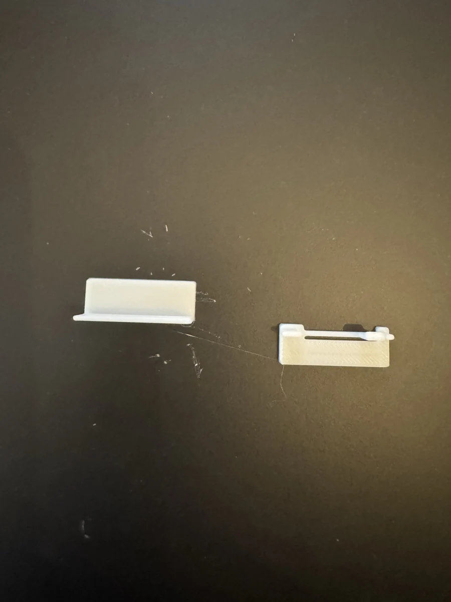
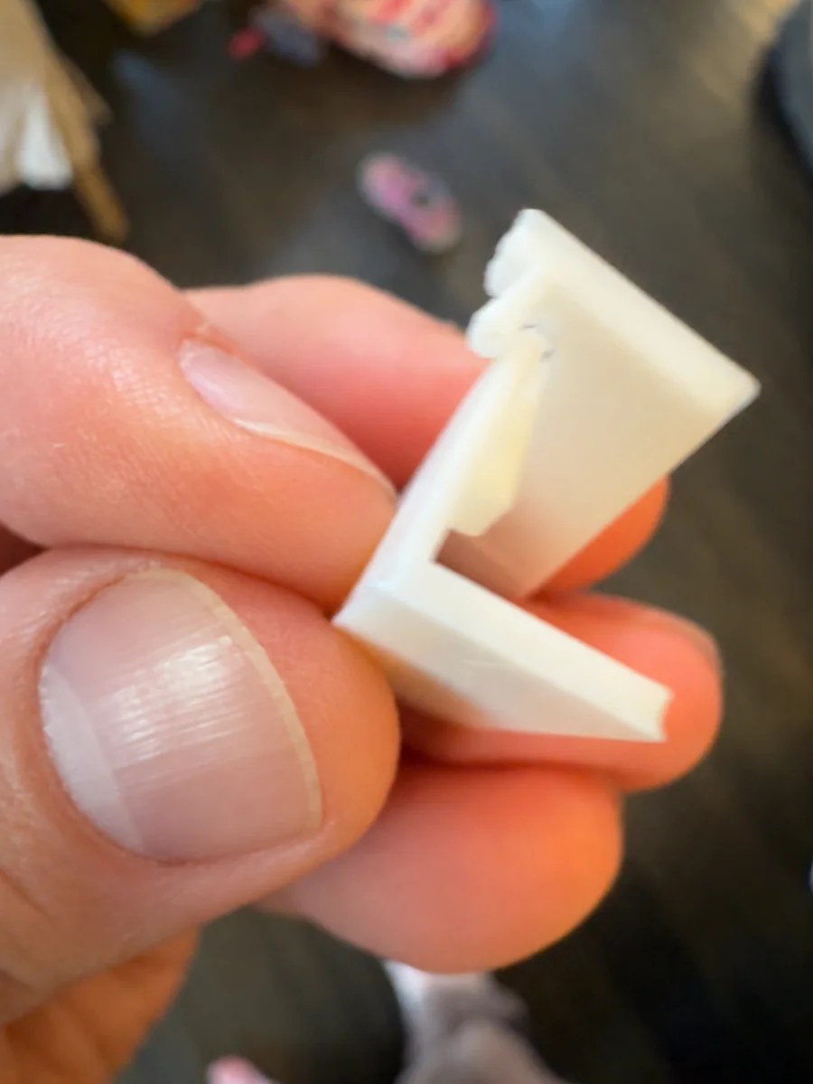
I asked for larger bases and simpler clips like the ones I’d seen on other printed objects. We looked at printed buckles and enclosure lids, then made a longer spring arm with a broad, ramped hook. The arm grew from about 18 to 30 mm long, the hook widened from 4.6 to 8 mm, and the guide clearance increased from 0.30 to 0.55 mm.
The revised bases were 48 by 20 mm, with a thicker grip area and a bevel underneath one edge to make removal easier. Those features had nothing to do with the final topper’s appearance, but they made the experiment much better. There was now enough of the sample to hold while I tried the joint.
We printed two versions. One dot identified a gentler 0.30 mm catch engagement; two dots identified a firmer 0.50 mm engagement. The dots were labels, not two separate hooks. Both worked, and I slightly preferred the two-dot version, so that profile went into all six positions around the full back.
The revised test used about 8.85 grams and took roughly 33 minutes with the filament selected for that job. The individual joints worked, but that didn’t yet tell us how six of them would behave around a large star-shaped cover. That distinction was in the notes, and it would matter later.
There was also some practical printer bookkeeping throughout these tests. Bambu sometimes selected A3 automatically when I wanted A1. Later, when white was physically in A1, the saved registration still described that slot as magenta. We had to distinguish the filament actually loaded from the color shown in the preview and verify the send mapping. A pink-looking preview wasn’t evidence that the diffuser had been redesigned in pink.
Before the next full back, I asked for a larger, deeper builder mark. The original recess had been a little too subtle. The new lettering was 72 mm wide and 1 mm deep, with material left beneath it so it stayed an engraving rather than becoming another light opening. That mark survived all the later back revisions.
Two layers of white plastic
The first hollow design had open tube-shaped holes. After seeing it, I wanted a thin white layer over those openings so the front would look more finished without a light behind it. At a 0.20 mm layer height, two printed layers gave us a 0.4 mm membrane to test.
We made a 64 by 44 mm sample cut from the actual face geometry, four millimeters thick, with six complete light windows and parts of neighboring ones. It wasn’t a scaled-down star, because scaling everything would also change the thicknesses and details we were trying to evaluate. A two-millimeter handling border made it one manageable piece.
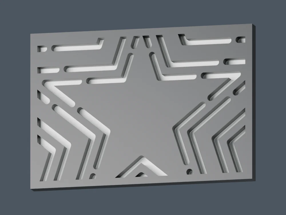
The first sample kept the dark outlines around each tube. While that print was underway, I realized I wanted to remove the outlines as well. The face could look like three continuous white stars when unlit, then reveal the segmented tubes when illuminated. That brought back the simplicity of the earliest concepts while keeping the detail we’d spent so much time reconstructing.
The revised construction used thicker white material around the windows and black behind it to block light. Only the tube-shaped areas had the thin white skin. Seen from the front, the colors no longer announced where every tube began and ended; the difference was mostly in the material behind the surface.
This reduced the white geometry from 133 separate solids to three connected bands. I’d expected that simpler geometry might also print faster. Bambu’s comparison was less cooperative: the full continuous-band front used about 0.31 grams less filament, but took an estimated four minutes longer than the outlined version. The tall shell still accounted for most of the job, and fewer visible details didn’t translate directly into less machine time.
I let the first test finish because it still answered the important translucency question. The light transmission looked good, so we prepared a second sample without the outlines. That one took about 52 minutes and used 12.9 grams, including the printing extras. After the revised test looked good too, I asked to print the full front.
The digital checks were quite specific by then. We inspected the actual extrusion paths to confirm that each window received white on the first two layers and no black across its interior. For the full front, that meant checking all 130 windows. A model showing a thin white floor wasn’t enough if the slicer filled the space above it with black.
Even those checks only described what the printer was being told to do. I still needed to hold the physical sample in front of a light and decide whether I liked the result. The small tests made it much less expensive to answer that question before printing another full shell.
The printed face sent us back to the geometry
The first full continuous-star print looked pretty good, but the proportions bothered me again. I sent a photograph and asked whether the top point of the smallest star was too shallow. The gaps also looked crowded. This was after all the tracing, comparisons, and earlier spacing discussions, so it was a frustrating thing to still be questioning.
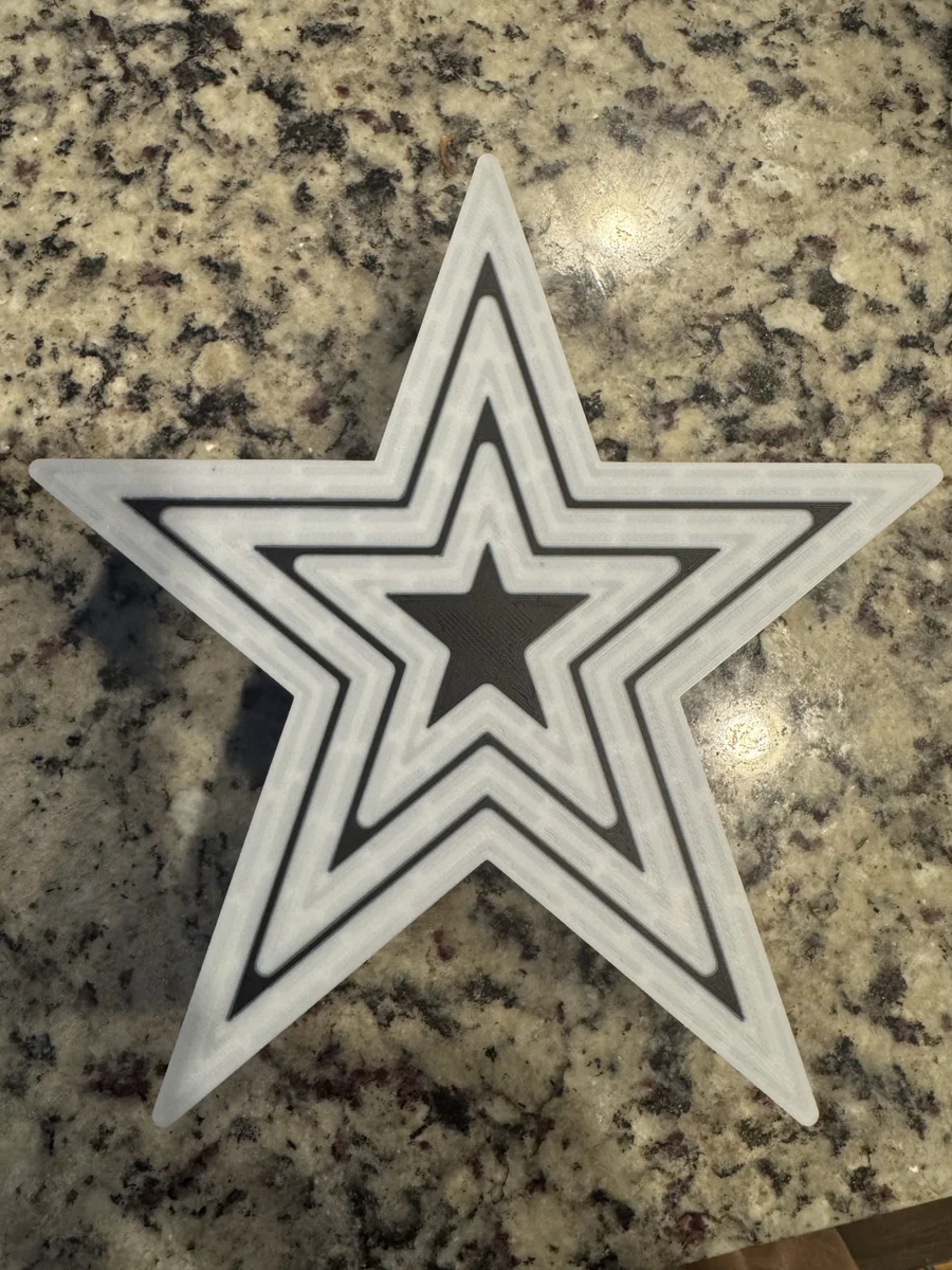
Comparing the current model with the original photo-derived paths explained part of it. The parallel-offset correction had lowered the middle apex by about 3.6 mm and the inner apex by about 4 mm. For the smallest star, the height above its shoulders had dropped from roughly 27.9 to 23.9 mm, a reduction of about 14%.
The fix to one visible problem had created another. The individual paths were neatly aligned, but the inner upper points had become too short relative to the earlier reconstruction. That was much easier to notice once the face consisted of broad white stars instead of lots of segmented line detail.
We made a separate proportions revision, restoring the taller middle and inner points while retaining the established lower edges. We also reduced the extra white margin around the tube tracks. That widened the black gaps at the shoulders from about 1.6 mm to a little over 3 mm.
Rebuilding that face introduced overlapping triangles at the boundary where the one-millimeter white layer met the black backing. Those needed cleaning up before the exports could be considered ready. It was another reminder that changing a two-dimensional profile could create work in the material boundaries of the actual printable solid.
The V2 model passed the mesh checks and retained the thin windows, but I still thought the spacing was off when comparing it with a reference photograph. This time we looked directly at the widths of the structural bands and the gaps between them, instead of relying only on the tube centerlines.
The next revision narrowed the white bands to roughly 5.7 mm at the measured shoulder and widened the gaps to about 4 mm. It also added a thin dark perimeter around the outer white star. The corrected paths and all 130 windows stayed in place between V2 and V3; it was the material surrounding them that changed.
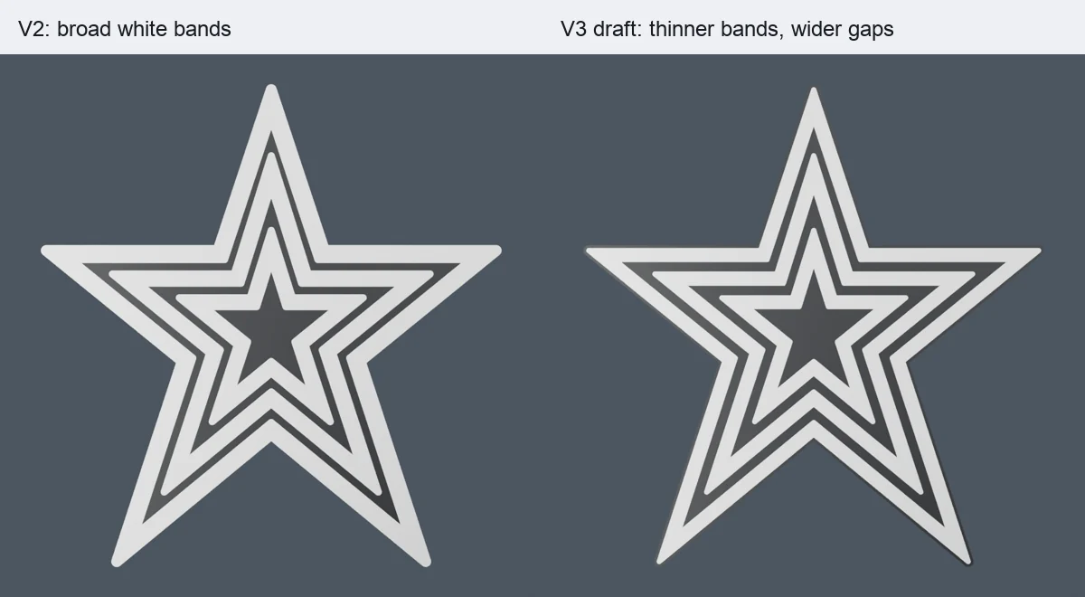
This was the face I finally liked. The new front kept the shell and catch arrangement compatible with the existing back design, and its slice came to about 3 hours 51 minutes and 95 grams. We committed V3 and printed it, then printed the matching back.
The back was still held on with tape
After the front was finished, the six-clip back didn’t attach as well as I’d hoped. I managed to get it reasonably well secured with tape, but the mechanism felt too complicated. The isolated two-dot sample had worked; fitting a whole cover with six clips and a surrounding rim was a different experience.
I wanted to simplify the back and keep the front I’d already printed. There was no reason to throw away a good four-hour shell because the cover was awkward. The existing catch openings, wall positions, and bottom entrance became constraints for every replacement.
The next attempt removed the old hooks and perimeter rim and used four broad spring tabs pressing against the inside walls. Each tab was 14 mm wide and extended 18 mm into the shell. This was a friction fit rather than a hooked lock, with tapered tips intended to make insertion easier.
We made another pair of small samples, again marked for gentle and firm fits. This time they were designed to try against the actual printed shell, on the straight wall of its upper-right arm. There was no need to print a separate mating wall and hope it behaved like the real one. The two samples together were about a 25-minute, 5.3-gram job.
Those samples were sent to the printer, but I changed direction before choosing that design for the final back. I wanted an inset ridge running around the perimeter, with fixed tabs built into it to line up with the existing holes. Instead of six individually moving latch arms, I would gently flex the cover or shell enough to seat the tabs.
The ridge was right; the tabs were too short
The new ridge followed the available perimeter, ending at the two sides of the tree opening. It was 0.8 mm thick and 6 mm deep, with six fixed tabs. The original backplate, eight vents, builder mark, and 100 mm bottom opening stayed in place.
There was a small but consequential alignment detail during the build. The old clip anchor coordinates weren’t the centers of the actual holes. The new fixed tabs needed to align with the openings themselves, so we checked them against the existing shell geometry and the original window cutters.
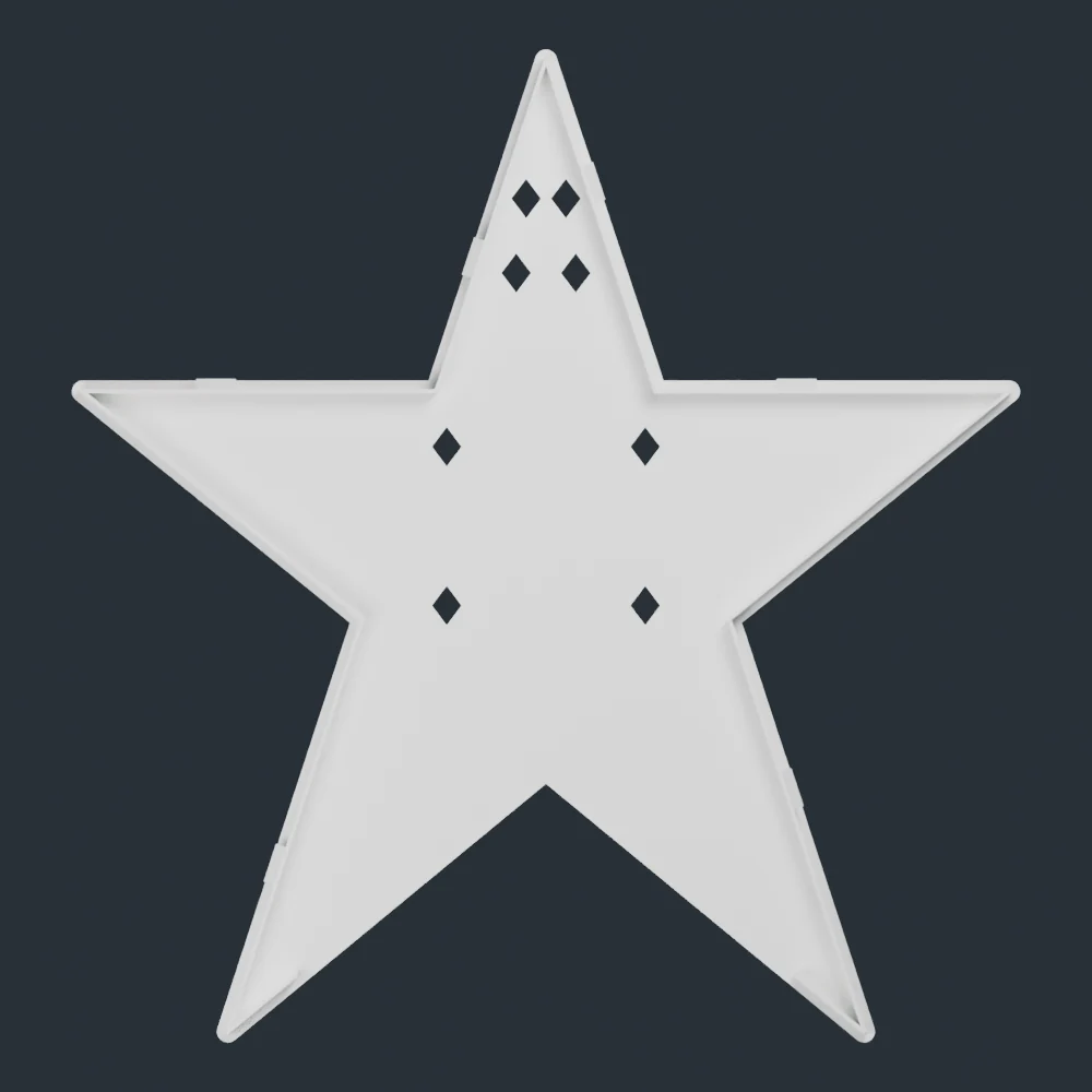
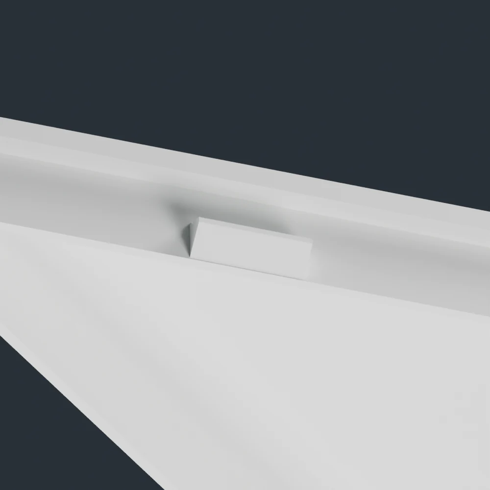
The first full ridge back took about an hour and 31 grams. When I tried it, the overall approach felt right, but the tabs still didn’t quite lock. This time I didn’t ask for another kind of connector. I asked to double the tabs’ length and print the back again.
More precisely, the outward projection grew from 1.05 mm to 2.10 mm. The tabs remained 8 mm wide, centered in the existing 9.2 mm catch windows. The longer noses also needed a small trim at their upper edges so they would clear those windows. Everything else about the ridge and marked backplate stayed the same.
That revision added only about a tenth of a gram. Its checked slice was 58 minutes 54 seconds and 30.78 grams. The six-tab toolpath check confirmed that the extended features survived slicing, and the next morning I could finally report that it worked.
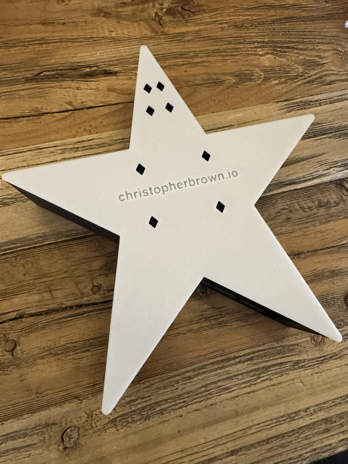
After all the clip experiments, adding about a millimeter of reach was a pleasingly modest final change. I had a removable cover that stayed attached to the front already on hand. I haven’t measured its holding force or tested hundreds of removals; what I can say is that this version fit and locked on my printed parts.
What the finished face does
The finished topper gives me the two appearances I wanted. Without backlighting, it reads as three white stars against a dark background. With a light behind it, the thin sections reveal the paired rows of segmented tubes. The detailed geometry survived all the revisions, but it no longer has to dominate the unlit face.
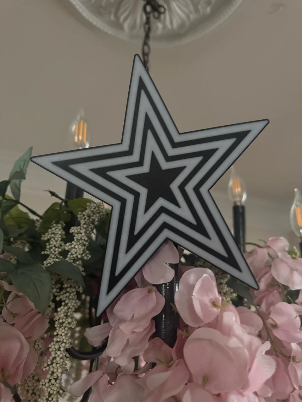
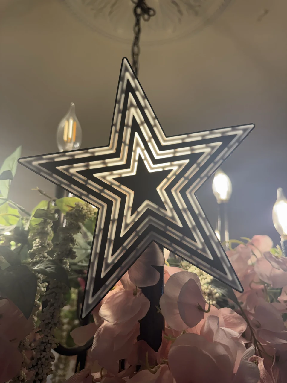
These are photographs of the actual print during testing, rather than a rendered Christmas-tree installation. The illumination depends on the filament, the light source, and how it’s positioned. The photographs are a much better account of what I achieved than a simulated glow would be, especially after all the work that went into making the physical result look right.
Packaging it for somebody else introduced one last practical correction. During the MakerWorld submission, I realized the project file being used contained the front shell alone. The matching back existed, but a person downloading the main print profile needed both.
We built a complete two-plate 3MF: the two-color front on the first plate and the white ridge back on the second. Each retained its existing geometry and print orientation. We opened and sliced both plates in Bambu Studio, including checking that the front kept its purge tower and the white-only back didn’t need one.
I also supplied the finished unlit, backlit, and rear photographs for the listing. The earlier test photos were useful for telling the build story, but they showed different parts. By this point there were enough versions that an attractive image wasn’t sufficient; I wanted the download, the description, and the photographs to refer to the same finished design.
What I got out of all those revisions
The useful part of this project wasn’t a single clever modeling trick. It was being able to keep comparing the idea, the files, the sliced layers, and the pieces on the table. The archive research clarified what was known about the landmark. The photo comparisons exposed proportion problems. The geometry checks found disconnected bodies and troublesome intersections. The slicer found costs and material assignments that the model alone couldn’t show.
The small printed artifacts were particularly worthwhile. The first connector sample told me that the joint wouldn’t seat. The larger pair let me compare engagement depths without printing a whole back. The diffuser samples let me judge the light transmission at the real thickness. Later samples tested against the actual shell, which was a better question than whether two idealized pieces fit each other.
Some improvements also had consequences that only became obvious later. Parallel lines made the lower notches cleaner but shortened the inner upper points. White backing bands made the first design more recognizable in daylight but reduced the visible dark gaps. A clip that worked individually wasn’t a guarantee that six clips around a star would be pleasant to assemble. Keeping the earlier files made it possible to go back and find what had changed.
Codex made it practical to do more research, generate more variants, and write more checks than I would have done manually. I still needed to notice that something looked wrong, question an overconfident conclusion, and try the printed parts. The most useful feedback in the project was often very plain: the cone isn’t attached, the point looks too short, the clip doesn’t snap.
I started because I wanted a reminder of home on our Christmas tree. I ended up learning much more about a familiar landmark, and about the fairly large distance between a convincing render and a useful physical object. I’m happy with where it landed, even if getting there required several backplates and an unreasonable amount of attention to the corners of a star.
Print your own
The original two-color topper on MakerWorld is the simpler construction: one print with an integrated rear socket, white backing bands, and visible outlined tube sections. It requires no assembly. The included A1 setup estimates about 2 hours 47 minutes and 70.5 grams of filament.
The illuminated snap-back topper on MakerWorld has the hollow shell, two-layer white light windows, and removable continuous-ridge back. Its complete project contains both plates. The current estimates are about 3 hours 51 minutes and 94.84 grams for the front, plus about 59 minutes and 30.78 grams for the back.
Those are slicer estimates, and different filament profiles and settings will change them. The mounting arrangements are different too: the original has a tapered socket, while the illuminated version has a wide bottom opening for the tree and lights. Check the dimensions against your own tree and the intended lighting arrangement.
The Roanoke Star project on GitHub includes the Blender scenes, STL and 3MF files, construction scripts, research notes, and validation records. It also preserves the hollow one-piece experiment and the development work behind the later versions. The original designs and model files are available under CC BY-NC-SA 4.0, allowing sharing and noncommercial adaptations with attribution under the same license.
If you print one, I’d love to see how it turns out. And if you happen to know where the original Roanoke Star engineering drawings ended up, I’d still be very interested. After spending this long looking at the photographs, I’d enjoy finding out how close we got.